Tidewell
- Role
- Product Designer
- Year
- 2026
- Industry
- Fintech




A fintech app that turns irregular foreign-currency payments into a steady naira salary.
Problem
Freelancers and remote workers in Nigeria are paid irregularly, in foreign currency, by clients abroad, but life isn’t irregular. Rent, bills and everyday spending run on a fixed monthly rhythm that lumpy income can’t keep up with. A $2,000 payment lands one week, then nothing for the next five, and converting and spending whatever lands, whenever it lands, turns budgeting into feast or famine.
Currency adds a second layer of risk. Naira depreciation makes holding dollars tempting, but bills are still due in naira on fixed dates. People end up converting too early and losing the upside, or too late and scrambling to cover a bill, and it’s easy to spend money that was actually earmarked for next month’s rent.
Design
Tidewell’s core trick is turning one irregular foreign-currency payment into a steady, predictable naira salary. When a payment lands, the app doesn’t hand it all over, it divides it: part goes toward a self-set monthly salary, paid out steadily like payroll; part is held in a buffer against future low-income months; part is set aside for upcoming bills.
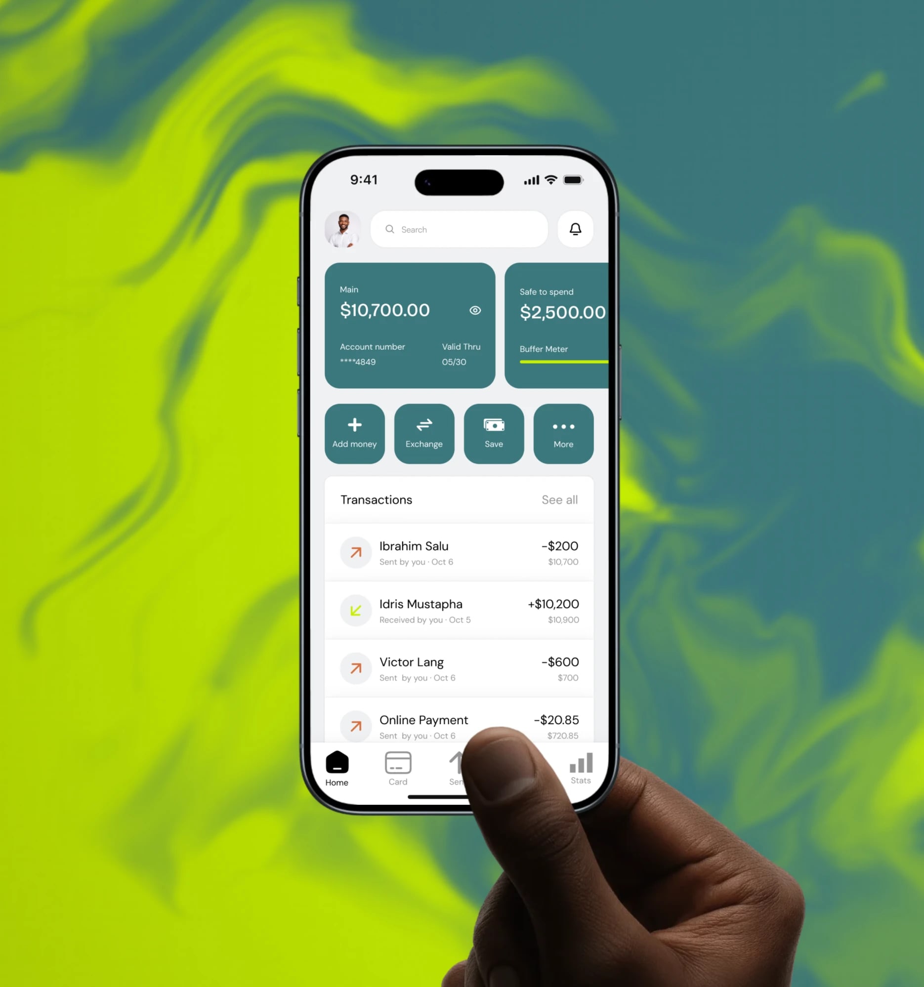
Every screen protects one number: safe-to-spend, the wallet balance, minus salary already owed, minus bills due. It’s the amount a person can actually move right now without eating into next month’s pay or an upcoming bill, and every transfer, bill payment and send in the app checks against it before letting money move. The buffer answers a second question: how many months of salary are covered even with zero new income, so the whole system reads less like a freelancer’s spreadsheet and more like being salaried. Freelance income in, a smoothing engine, steady salary and protected bills and buffer out.
Solution
- Home: balance, safe-to-spend, buffer status and recent activity, with a pull-to-reveal gesture on the balance card.
- Divide: the flow that splits an incoming foreign payment across salary, buffer and bills when it lands.
- Plan: setting a monthly salary and payday, and forecasting how long the buffer will last.
Competitor Analysis
Before designing, I looked at what Nigerian freelancers already use to receive foreign-currency payments. Of the apps and platforms often named alongside fintech products like this, only five are genuine competitors for this specific job: Grey, Raenest, LemFi, Payoneer and Wise. None of them turn an incoming payment into a scheduled personal salary, reserve money against a specific bill, or protect one honest “safe to spend” number. That gap, not price or payment rails, is where Tidewell’s design sits: a behavioural layer for pacing irregular income, not another place to park it.





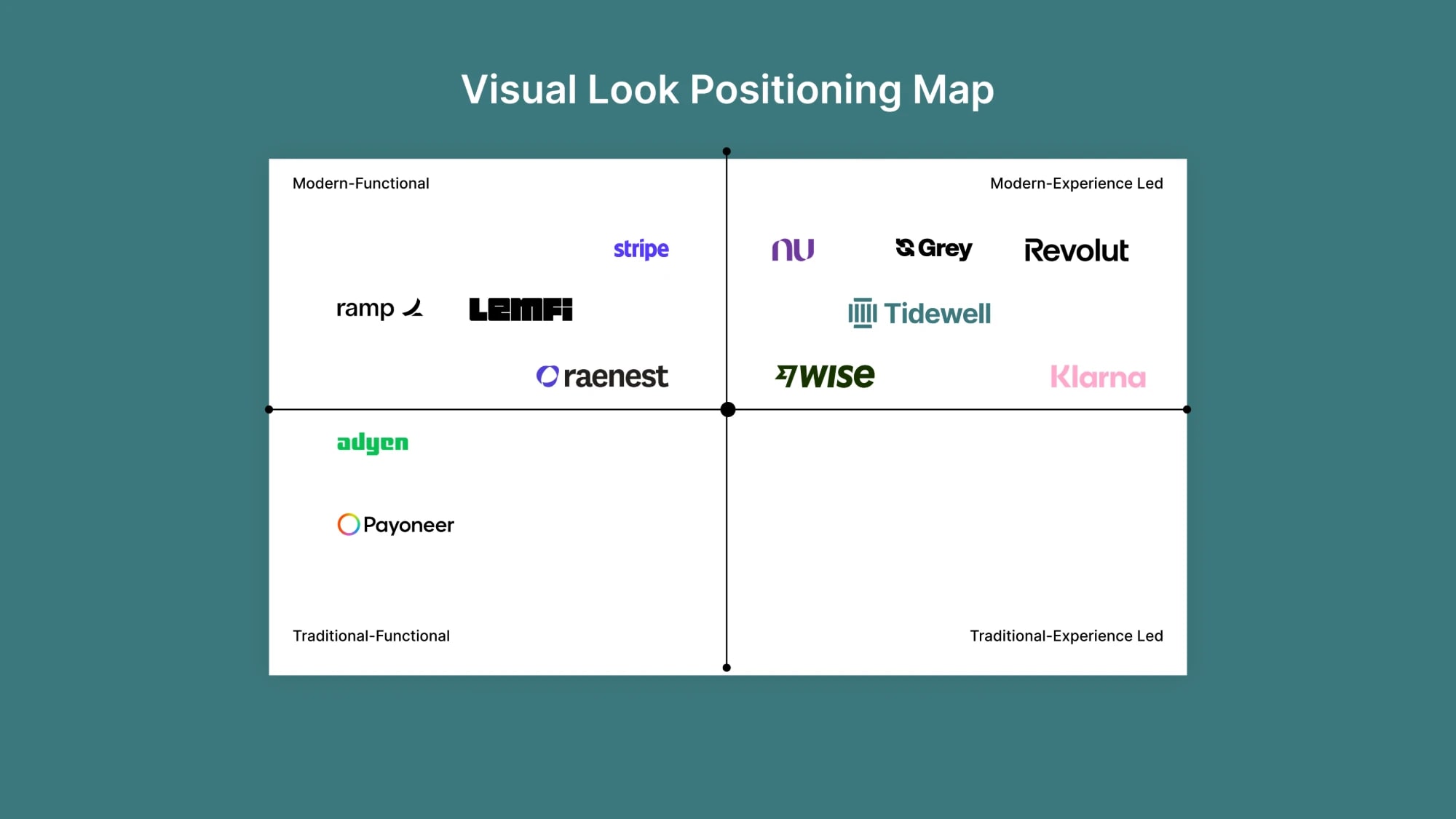
Visual Look Positioning Map
Alongside the competitive analysis, I mapped the same brands on a different axis: not what they do, but how they feel. One axis runs traditional to modern, the other runs functional to experience-led, plotting tone rather than features.
Most of the field sits in the modern half. One cluster (Stripe, Ramp, LemFi, Raenest) reads modern but restrained, utilitarian products built for a job rather than a feeling. The other (Nu, Grey, Revolut, Klarna) leans fully into experience, bright, consumer-energy brands designed to feel exciting to open. Only Adyen and Payoneer sit in the traditional half, both read as older, more infrastructural and less designed for how they look.
I placed Tidewell in the modern, experience-led quadrant, but closer to the centre than the edge. The brief wasn’t to out-bright Klarna or Revolut, it was to feel calm and dependable for someone whose income already feels unpredictable. Modern and considered, not loud, is the position the rest of the design works from.
This is a qualitative read of tone, not a data-backed benchmark, it’s here to justify a design direction, not to make a claim about any of these companies.